Kärr-Trollet

Haven’t posted anything for a while. I’m not dead, and I haven’t quit drawing. So there.

I’m currently working for Sluggerfilm in Malmö on Bamse och Tjuvstaden (Bamse and the City of Thieves), the first Bamse feature film! I don’t know how much I’m allowed to blog about this, but I think I can say that it’s going to be good. Really good!

Among the artists involved in the production are Thomas Holm (who’s also art director for the film), Lars Bällsten, Adam Blomgren and Ola Larsson. I’m proud to be part of such a great team! I worked with Thomas on the pilot a year ago. You can see some clips from it at the Tre Vänner website.

Speaking about the bear, Bamse the comic #12 just came out. Another PM-story with my drawings is in it! “Kärr-Trollet” was written by Rune Andréasson, pencilled by me and inked by Kerstin Hamberg.

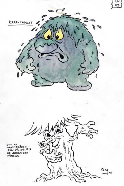
Rune Andréasson’s character design.

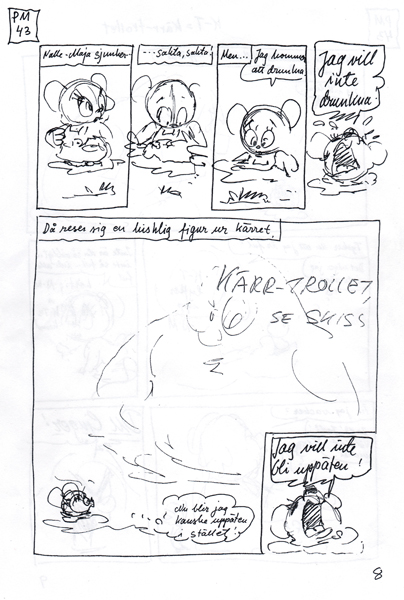
Rune Andréasson’s script.

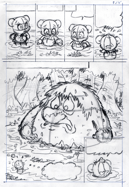
My interpretation of Rune’s script.

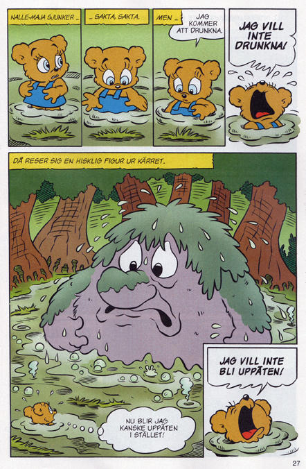
The printed page. Ink by the one and only Kerstin Hamberg.

The troll is huge compared to Nalle-Maja and the others. This is emphasized by Rune’s creative layouts throughout the story. I tried to make as much out of it as possible. The troll itself was fun to play with, expression-wise. Thanks to the editors for letting me have a go at yet another of Rune’s few remaining scripts!

All images in this post are ⓒ Rune Andréasson

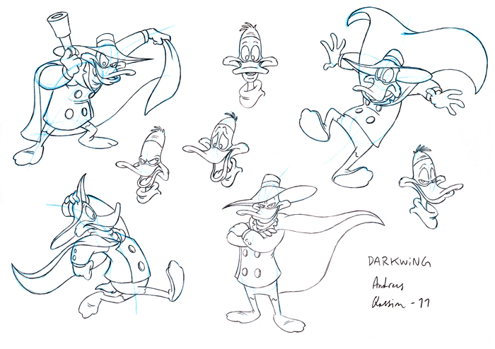
Darkwing Duck

Found these in my archives.

About a year ago I posted some Muppet art work at Boom Studios Artists Gallery. Boom used to have a series of pretty neat Muppet titles, starting with Roger Langridge’s awesome Muppet Show Comic Books. I thought it would be cool to draw the Muppets. For real you know?

I was more than a little surprised when I got an e-mail from a Boom editor asking me if I wanted to make some sample drawings for Darkwing Duck. It’s funny in two ways. 1) I hardly know Darkwing at all. And I’m not really into the Disney style. I’m much more attracted to highly stylized stuff, like you’d find on Nickelodeon and Cartoon Network in the 90s. Maybe it’s not that visible in my body of work so far, but just wait and see… And 2) Nobody ASKS you if you want to draw a Disney comic. The way it normally works is you headbutt the editors’ locked doors for years and years before they even let you try.

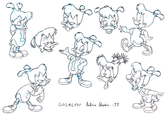
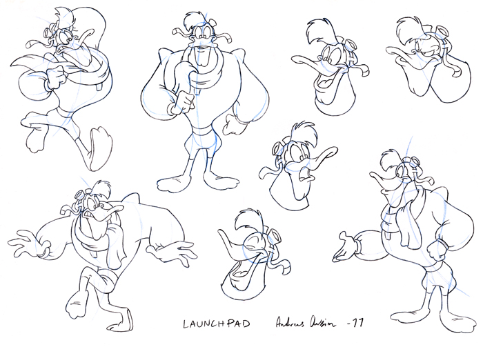
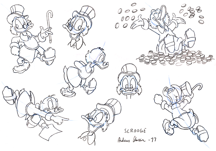
Anyway, I was busy with another project at that moment and had no choice but to say thanks but no thanks. Some months later I e-mailed the editor asking if he was still interested in me having ago. Sure, he said and sent me some model sheets. So I made these character studies of Darkwing, Gosalyn, Launchpad (in spite of my unfamiliarity with Darkwing, I always liked Launchpad!) and Scrooge.

So what did the editor think? I don’t know. He never replied. Was it because my drawings sucked? Was it because I stuck too close to the original model sheets? That’s how I learned new styles in the past. First you copy, getting to know the construction of the characters, then you make your own poses and expressions. Maybe the editor expected something else? Or was it simply because Boom lost their rights to the Disney titles, and my timing was unfortunate? I guess I’ll never know. Anyway, it was fun to try something different.

Character design

When I design characters for a project, I hardly ever end up using the initial character skecthes. Well, come to think of it, I NEVER settle for the initial design. Here’s two cases of characters evolving from something to something else.

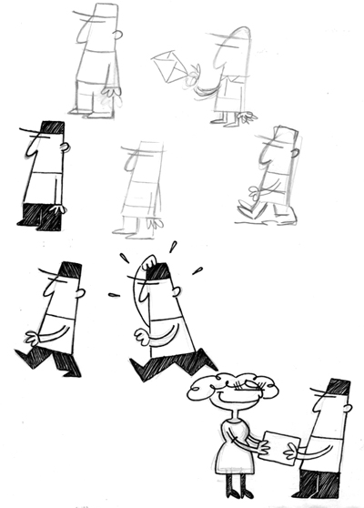
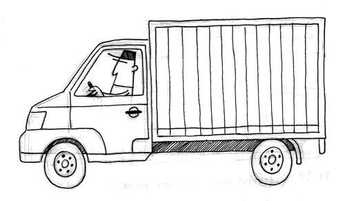
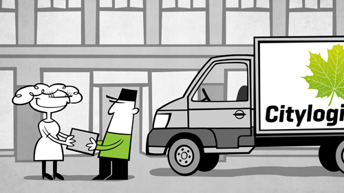
I designed this delivery man for an informercial we did for the Copenhagen municipality project Citylogistik.

cl-man_skiss

The customer wanted something reminiscent of La Linea (Linus på linjen).

cl-lastbil_skiss

scenbild_skiss

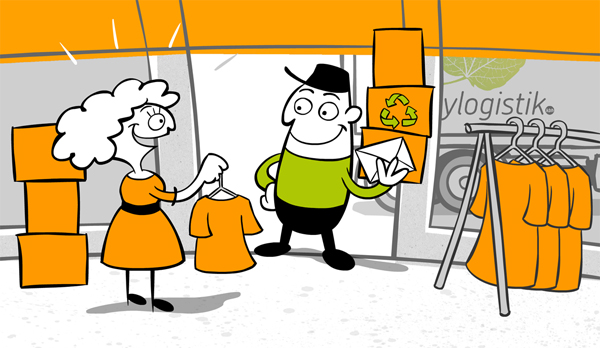
One of the most common forms of “critique” I get is that I draw too cute/too kiddie style. Funnily enough, this time the customer wanted it to be cuter and rounder. No problem! 🙂 So I ended up with:

final_design

You can watch the film here.

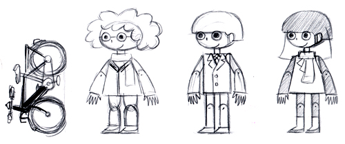
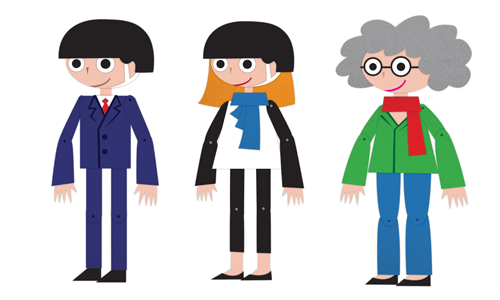
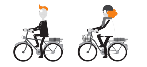
The second example is for another Copenhagen municipality project called Cykelsuperstier. The customer wanted “a simple cut-out style”.

characters_skiss

I looked at Terry Gilliam’s work, Southpark and some JibJab stuff. I was also inspired by the demo illustrations in the Zelda game Phantom Hourglass (the gallery section).

modelsheet_characters_color

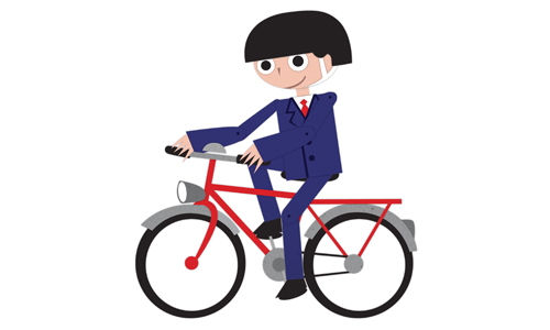
Design decisions should be based on function. I had to elongate the legs for the characters to be able to ride bicycles.

modelsheet_cykel_color

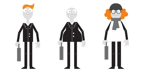
The customer thought it to be too kiddie style (again!), so I opted for a more “adult” or neutral look, and ended up with:

modelsheet_characters111222

modelsheet_bikes111222

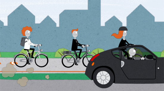
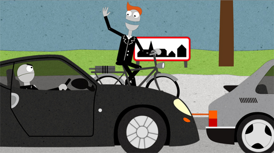
A couple of stills from the film:

css_stillbild1

css_stillbild2

The three of us working on these films – Alfred Gunnarsson, Niklas Ström and me – call ourselves Animationsbyrån. We’ll launch our new website shortly. We just completed the Cykelsuperstier infomercial. You can watch it here.