TL at the Zoo


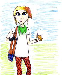
Studio Qassim has begun work on a brand new and exciting project called “TL på Zoo” (TL at the Zoo). It’s an illustrations and comics assignment for a Swedish book club for girls called “TL-klubben” (www.tl-klubben.se). The idea is to make a comic book (from scratch!) for TL’s members, its story taking place in a zoo. What’s unique about the book is that its characters will be created by club members. A number of drawing contests will be held, and the winning submission from each one will be redesigned by me into “a real comic book character” as it will appear in the upcoming book. The winner of competition #1 was Abigail.
0608tlzoo_del1_tillserie_blogsizex.jpg

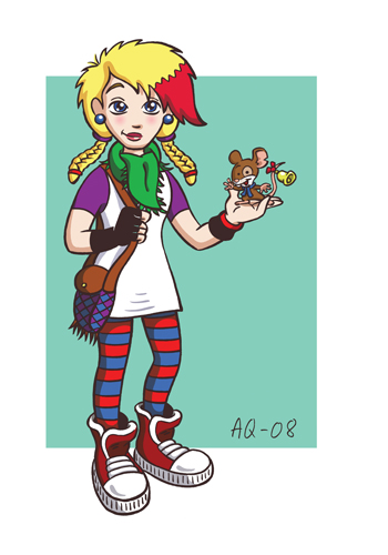
Her drawing as well as my redesigned version were published in TL-magasinet #6/08 (the magazine that comes with the monthly book package). Redesigning members’ drawings is an interesting challenge that reminds me of Mega Man 4, where the game designers arranged competitions among fans to get new ideas for boss characters. I really like Abigail’s drawing, and so I took great care not to “wreck” it. My job is not so much to make it better (Abigail’s drawing is good as it is!), but to design this character and future characters in a coherent style that will be possible to draw (in different angles and expressions) in the upcoming comic book.
0608tltjejen_blog.jpg

TL-magasinet #6 also feautures a quite lengthy interview with me, one of the better ones I’ve been involved with actually (except that they spelled my surname wrong, but I guess I can live with that). Except for the article, my (first and rightly spelled) name was on the cover (in good company with Håkan Hellström and Panic at the Disco – WHOA!), my picture in the table of contents, AND in the editorial I was presented as “one of the coolest cartoonists in the world”! Not bad indeed. It’s great that TL wants to promote their comic artists. Unfortunately the article is not on TL-klubbens website, you have to be a member to read it.

High school/College graduation


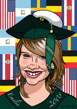
The sister of a friend recently graduated from the International Baccalaureate programme at S:t John’s International School in Brussels. I was asked to make some kind of caricature/portrait of her that her sister could wave at her upon graduation day. The sister apparently suffers from something called vanity, so the instructions were not to overdo the caricature aspect. That was tricky, and I think I ended up with a “comic babe” instead of a funny caricature. Anyway, I’m still quite happy with the result.

0608emelie-sundelin_color_done_blogsizex.jpg

I wanted to color it digitally, and since the picture had to be quite large I needed the assistence of someone who knows printing better than I do. I turned to my friend Emma Agering at Basquer (http://www.basquer.com/) and talked her into making the portrait with me. Thus I have made my first ever “collaborative portrait”.

Emma also happens to know the graduating sister, so the choice was perfect. The flags in the background was my idea, but she was the one who made it work. And more importantly, Emma printed the picture on canvas. Let me tell you, canvas is the shit! The print is so rich in colors and the black is mega black! The screen doesn’t really do it justice. So in the end my friend got this really luxury print that her sister can hang on her wall (unlike the average tacky grad-pics that are usually shoved away in the basement or the like).

If you’re into cool bags you should check out Basquer’s laptop bags. The first edition was released recently. I was at the release party and it was like going to an art gallery, but with bags on the wall instead of pictures. The bags looked awesome! As a matter of fact I have designed the print for one of the bags of the second edition to be released this fall. Keep you’re eyes open, and check out the Basquer website every now and then!

CARICATURES


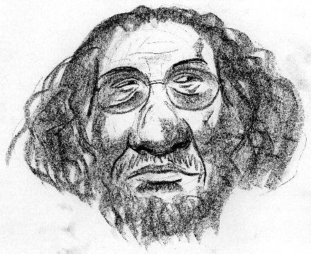
I just completed this caricature course that I’ve been attending the last two months or so. Our teacher, Iraqi artist Abdulilah Al-Le’by, looked approximately like this:

0508abdulilah_blogsize.jpg

In spite of me being brainwashed from making children’s comics for too long, almost having lost in the process the ability to make drawings representing reality, he actually managed to teach me some stuff:

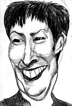
1) Using the right drawing tools is important. Cretacolor’s Nero lead crayons (soft) and a pad of heavy smoothly surfaced A3 paper (NOT light paper or ruffly surfaced paper) will facilitate your chances of making better portraits quicker.

0508mona_salin_blogsize.jpg

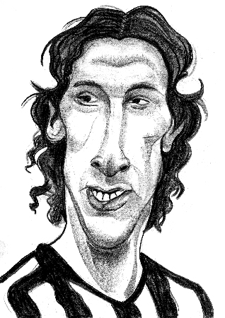
2) The most important features of a face is its eyes. If you don’t get the eyes right, it doesn’t matter how well you draw the rest of the face. The lookalikeness won’t be there. This goes for both traditional portraits and caricature portraits.

0508zlatan_blogsize.jpg

3) I really suck at shading. However, Abdulilah taught me what to look for, how to follow the muscles and shapes of the face to make it more “3D”. I have yet to master this, but I’ll definately hear Abdulilah’s words echoing in my mind the next time I make a portrait.

Blues and Gospel 11/5

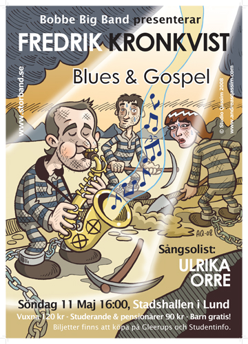
This spring’s main thematic concert for Bobbe Big Band is a blues and gospel concert fronted by guest saxophone soloist Fredrik Kronkvist and our faithful solo singer Ulrika Orre. Blues and gospel are closely related genres, like two sides of the same coin, so it’ll be interesting exploring the two back to back.

0408affisch_blogsize.jpg

This time we’ve rented the city hall of Lund to try to get away of people thinking we’re a “student band”, wich we’re not, actually. I made this poster to try to sell as many tickets as possible (and we really need to, to be able to pay the rent of the hall). Unfortunately I was too crap at the Adobe CS programs to make it really high resolution. It looks better on screen than in print, but there you go. I’ll try to do better next time.

I want to wish each and everyone of you out there a warm welcome to this very special concert at May 11, 1600 hours. I will hardly be able to play myself since I’ll be busy studying the golden tones of Fredrik Kronkvist’s amazing solo playing…

Check out http://www.fredrikkronkvist.com/movie_NEW3.html if you want to know more about this excellent musician.

Uarda – 100th anniversary


This spring is special in the university city of Lund. Lundaspexarna’s flagship, Uarda (the student variety show), celebrates 100 years. To think that this “studentspex” has been produced like every five years, and more, since 1908 (!) at AF-borgen in Lund is almost hard to grasp. For me personally, this is my 10th, AND LAST, spex (like I’ve said so many times before).

0408uardalogga_blogsize.jpg

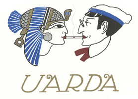
This classic Uarda logo was drawn by illustrator Harald Sjövall.

I wanted to try to leave an impression by making a theater program booklet out of the ordinary, so I attracted my old friend Alfred Gunnarsson to the project. Alfred was head of the carnival computer game “8 Bitar – Jakten på Karnevalsbiljetten”. This guy knows printing like the back of his palm and is a creative son of a mother, so I was extremely happy to join forces with him. Together we came up with the longest program booklet ever (“as long as the show, 2:40”), rolled up like a very long piece of parchment. My role was to illustrate it in the spirit of Sjövall.

0408eon_blogsize.jpg

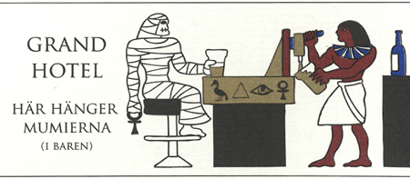
One of the main challenges of making this “booklet” was to think up ideas for all the ads for our sponsors. Several members of the creative ensemble helped us in this process. The tricky part was to make it all into a coherent piece of work. I came up with the idea to try to feature as many of the characters from the play in the ads, and draw them like Egyptian 2D wall paintings (almost). I think this helped the look of the program a great deal.

0408grand_blogsize.jpg

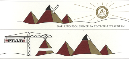
Not all ads had characters. These two simple and effective ones were designed by Alfred.

0408tetrapeab_blogsize.jpg

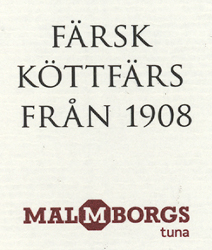
The greatest ad however was the one without an illustration. “Fresh meat from 1908”. It’s even funnier if you’re Swedish. I love companies with a sense of humor.

0408icatuna_blogsize.jpg