Lambiek

Hey! I just found out that I’m included in the Comiclopedia at Lambiek.net. Quite an honor I must say. A dutch comic site apparently. They seem serious enough. They even spelled my name right and got most of the facts right. Is that cool or what? I also note that my dear colleagues Johanna Kristiansson, Hedvig Häggman-Sund and Joakim Gunnarsson were added the same day as me. Hm… coincidence or not?

By the way, I’m also at Wikipedia (Swedish version). How about that? It’s sort of funny when you find something about yourself on the net that you didn’t put there yourself. Good for the ego, yes, but also a bit scary. If you haven’t already, try googling your own name. You’ll be surprised how many hits you’ll get.

more TanimaL

The final winner in the character design competition was Elvira from Åsele who drew Iris’s love interest:

 tlpojke elvira

My interpretation of Elvira’s drawing:

 tlpojke andreas

And that was that with the characters. What remained for me was to draw the story featuring these five characters. Pencilling, inking and coloring meant two months of INTENSIVE work. I delivered two days or so past deadline in the middle of October, and then I slept for like a week. The comic book will be posted to the members of TL with the book package of January. Exciting times! Can’t wait to hear your reactions, dear TL-girls. I really hope you’ll like YOUR comic book!

 tanimal cover

A quick note about the cover. I was promised to make a wrap around cover, i.e. a continuous image that stretches from back to front. And so I did. Everybody happy. Thus the cover was supposed to look like the image above.

The same day the comic book was going to go to print (!) I was notified that they had changed their idea and squeezed in the whole wrap around into one single cover. I thought it was a bad joke at first, but it wasn’t. The layout was thus completely ruined and they had tried to make up for it by smudging things out with the smudge tool…

 tanimal cover messed up

Unfortunately it is this corrupted cover-version that is featured in the ad for TanimaL in TL-magasinet. Totally beyond my control I’m afraid. The corrupted cover is the result of seriously BAD communication. It’s what happens when you run over people. I have to say this, because my name is being promoted with the release of TanimaL, and I would never hand in a cover such as the one above.

Luckily enough, I was given a few hours to try to save it. What will go to print eventually is this:

 tanimal cover saved

It is in no way ideal, as far as lay out goes, and I’m still a bit cross about this, but at least it is better than the ad i TL-magasinet. What’s on the back cover I’ll leave as a surprise until January…

TanimaL

The remaining character designs for TanimaL were featured in the latest TL-magasinet.

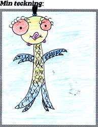
Elin from Karlstad drew the water creature:

 hjärtrud elin

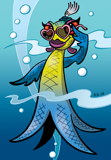
My interpretation of Elin’s character:

 härtrud andreas

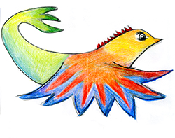
Clara from Åkersberga drew the flying animal:

 flygdjur clara

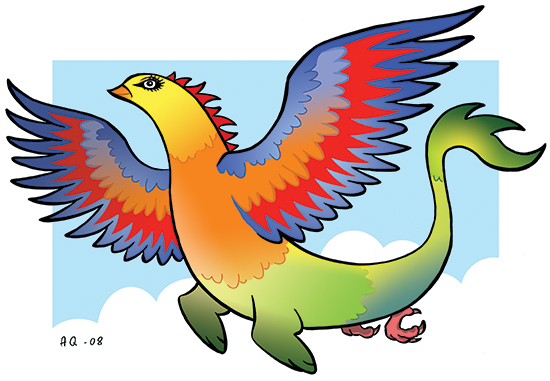
My interpretation of Clara’s character:

 flygdjur andreas

There are many more drawings posted at

http://www.tl-klubben.se/tl-paa-zoo/category1701.html

Go check ’em out. I really love your drawings, dear TL-girls! I hope my humble interpretations of YOUR characters won’t disappoint you. Remember to always keep on drawing, and you’ll be miles ahead of me before you know it!

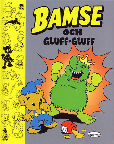
BAMSE OCH GLUFF-GLUFF

The hard cover book BAMSE OCH GLUFF-GLUFF just came out. It’s “my” first book ever! Yeah!

1008bamse_gluffgluffomslag.jpg

© Rune Andréasson

Text: Lisbeth Wremby
Pencils: Andreas Qassim
Ink: Kerstin Hamberg

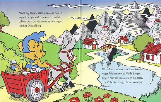
I loved being allowed to “spread out” visually over entire spreads for once.

1008gluffgluff10-11.jpg

That’s something else entirely than the usual layout puzzle of trying to cram everything – visuals, word balloons and text boxes – into constrictive panels. These large spreads makes for a much bigger and bolder look than what the average comic book page offers.

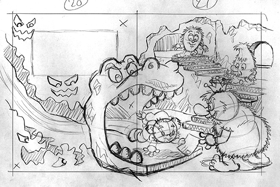
1008gluffgluffskiss20-21.jpg

I was given a dummy with text and VERY rough sketches by Lisbeth. The challenge was to try to “fill out” the spreads and at the same time leave sufficient space for the text. The overall look is supposed to be balanced and natural looking. Easier said than done!

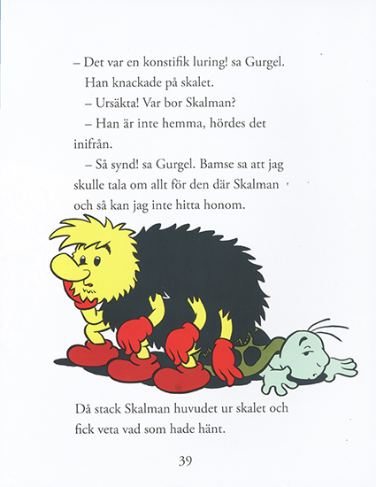
1008gluffgluff39.jpg

Not all images were complicated however, like the one above. By the way, I chose to stick very closely to Fransisco Tora’s original drawings (BA #6-7/1978). I find his characters (gluffarna in particular) hilarious, so there was no reason to change them.

All in all it was a stimulating detour from the usual Bamse assignment. Actually, I’d say it’s one of the Bamse jobs I’m closest to satisfied with (an artist is rarely 100% happy with anything he’s made, at least not me).

BAMSE JULALBUM #18

I got BAMSE JULALBUM 2008 in my mailbox a while ago:

[kml_flashembed publishmethod=”static” fversion=”8.0.0″ movie=”http://www.andreasqassim.com/blog/wp-content/uploads/2009/08/ba_julomslag08.swf” width=”600″ height=”450″ targetclass=”flashmovie”]

Get Adobe Flash player

[/kml_flashembed]

© Rune Andréasson

Idea: Mårten Melin
Pencils: Andreas Qassim
Ink: Bernt Hanson
Color: Lise Jörgensen

This is my third cover for BAMSE JULALBUM. Thought I’d try a little Flash animation displaying the work process. Unfortunately I couldn’t find the rougher shetches. It doesn’t really start out as clean as the first image in the animation. Rather, that’s the third step or so in the process. Never mind. I hope you enjoy it anyway.