






The hard cover book BAMSE OCH GLUFF-GLUFF just came out. It’s “my” first book ever! Yeah!
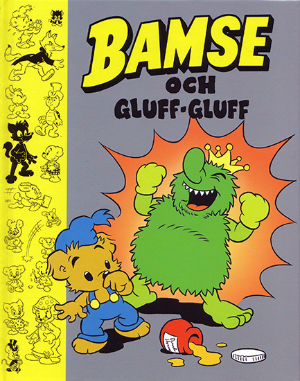
© Rune Andréasson
Text: Lisbeth Wremby
Pencils: Andreas Qassim
Ink: Kerstin Hamberg
I loved being allowed to “spread out” visually over entire spreads for once.
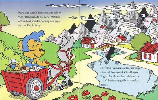
That’s something else entirely than the usual layout puzzle of trying to cram everything – visuals, word balloons and text boxes – into constrictive panels. These large spreads makes for a much bigger and bolder look than what the average comic book page offers.
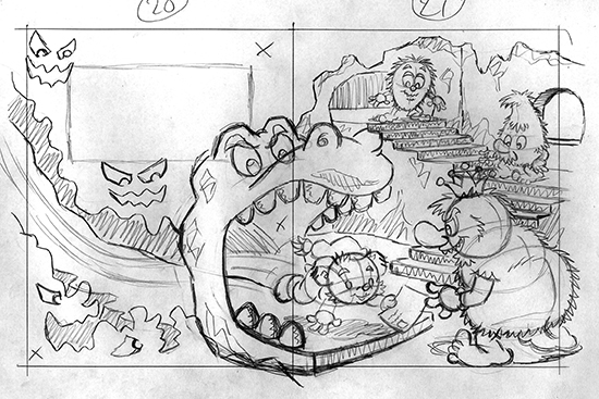
I was given a dummy with text and VERY rough sketches by Lisbeth. The challenge was to try to “fill out” the spreads and at the same time leave sufficient space for the text. The overall look is supposed to be balanced and natural looking. Easier said than done!
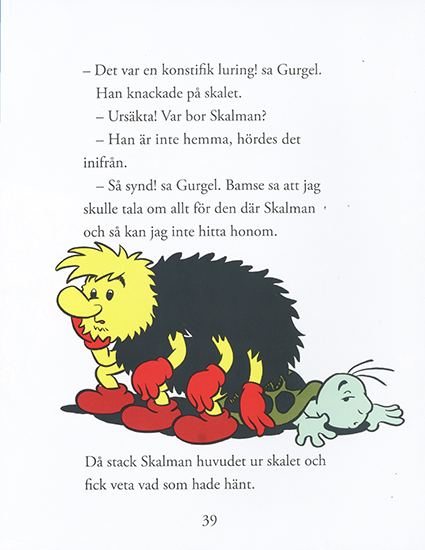
Not all images were complicated however, like the one above. By the way, I chose to stick very closely to Fransisco Tora’s original drawings (BA #6-7/1978). I find his characters (gluffarna in particular) hilarious, so there was no reason to change them.
All in all it was a stimulating detour from the usual Bamse assignment. Actually, I’d say it’s one of the Bamse jobs I’m closest to satisfied with (an artist is rarely 100% happy with anything he’s made, at least not me).
Character design for the upcoming comic book “TL at the zoo” (working title) continues. The result of competition #2 was published in TL-magasinet #8/08.
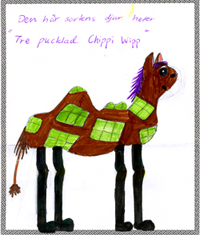
The winning contribution, “the three humped Chippiwipp”, was drawn by Sofia from Värmlanshult.
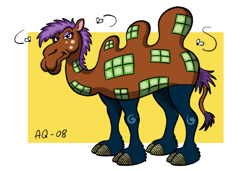
My humble interpretation of Sofia’s drawing. I don’t think I’m revealing too much if I say that Sofia’s character will play a major role in the comic book…
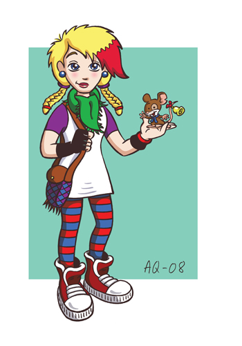
Studio Qassim has begun work on a brand new and exciting project called “TL på Zoo” (TL at the Zoo). It’s an illustrations and comics assignment for a Swedish book club for girls called “TL-klubben” (www.tl-klubben.se). The idea is to make a comic book (from scratch!) for TL’s members, its story taking place in a zoo. What’s unique about the book is that its characters will be created by club members. A number of drawing contests will be held, and the winning submission from each one will be redesigned by me into “a real comic book character” as it will appear in the upcoming book. The winner of competition #1 was Abigail.
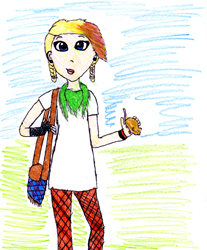
Her drawing as well as my redesigned version were published in TL-magasinet #6/08 (the magazine that comes with the monthly book package). Redesigning members’ drawings is an interesting challenge that reminds me of Mega Man 4, where the game designers arranged competitions among fans to get new ideas for boss characters. I really like Abigail’s drawing, and so I took great care not to “wreck” it. My job is not so much to make it better (Abigail’s drawing is good as it is!), but to design this character and future characters in a coherent style that will be possible to draw (in different angles and expressions) in the upcoming comic book.
TL-magasinet #6 also feautures a quite lengthy interview with me, one of the better ones I’ve been involved with actually (except that they spelled my surname wrong, but I guess I can live with that). Except for the article, my (first and rightly spelled) name was on the cover (in good company with Håkan Hellström and Panic at the Disco – WHOA!), my picture in the table of contents, AND in the editorial I was presented as “one of the coolest cartoonists in the world”! Not bad indeed. It’s great that TL wants to promote their comic artists. Unfortunately the article is not on TL-klubbens website, you have to be a member to read it.
The sister of a friend recently graduated from the International Baccalaureate programme at S:t John’s International School in Brussels. I was asked to make some kind of caricature/portrait of her that her sister could wave at her upon graduation day. The sister apparently suffers from something called vanity, so the instructions were not to overdo the caricature aspect. That was tricky, and I think I ended up with a “comic babe” instead of a funny caricature. Anyway, I’m still quite happy with the result.
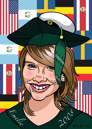
I wanted to color it digitally, and since the picture had to be quite large I needed the assistence of someone who knows printing better than I do. I turned to my friend Emma Agering at Basquer (http://www.basquer.com/) and talked her into making the portrait with me. Thus I have made my first ever “collaborative portrait”.
Emma also happens to know the graduating sister, so the choice was perfect. The flags in the background was my idea, but she was the one who made it work. And more importantly, Emma printed the picture on canvas. Let me tell you, canvas is the shit! The print is so rich in colors and the black is mega black! The screen doesn’t really do it justice. So in the end my friend got this really luxury print that her sister can hang on her wall (unlike the average tacky grad-pics that are usually shoved away in the basement or the like).
If you’re into cool bags you should check out Basquer’s laptop bags. The first edition was released recently. I was at the release party and it was like going to an art gallery, but with bags on the wall instead of pictures. The bags looked awesome! As a matter of fact I have designed the print for one of the bags of the second edition to be released this fall. Keep you’re eyes open, and check out the Basquer website every now and then!