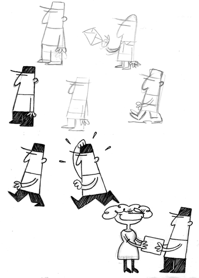
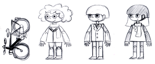
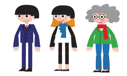
When I design characters for a project, I hardly ever end up using the initial character skecthes. Well, come to think of it, I NEVER settle for the initial design. Here’s two cases of characters evolving from something to something else.
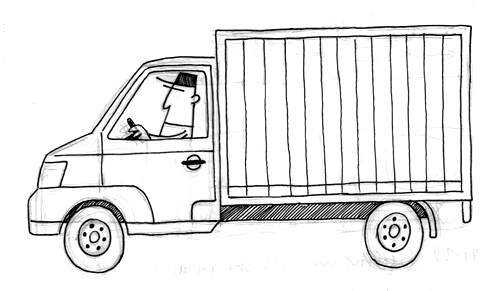
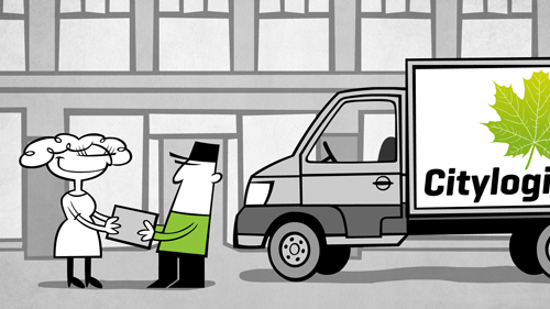
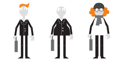
I designed this delivery man for an informercial we did for the Copenhagen municipality project Citylogistik.
The customer wanted something reminiscent of La Linea (Linus på linjen).
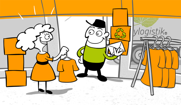
One of the most common forms of “critique” I get is that I draw too cute/too kiddie style. Funnily enough, this time the customer wanted it to be cuter and rounder. No problem! 🙂 So I ended up with:
You can watch the film here.
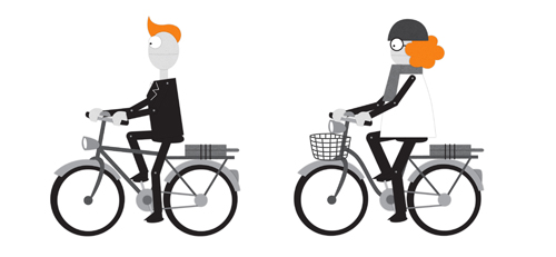
The second example is for another Copenhagen municipality project called Cykelsuperstier. The customer wanted “a simple cut-out style”.
I looked at Terry Gilliam’s work, Southpark and some JibJab stuff. I was also inspired by the demo illustrations in the Zelda game Phantom Hourglass (the gallery section).
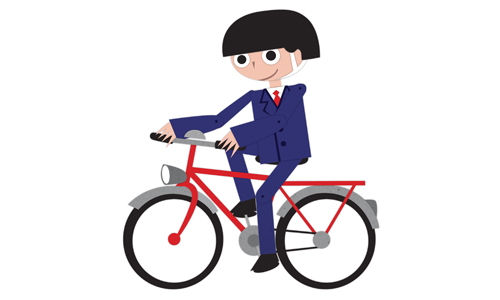
Design decisions should be based on function. I had to elongate the legs for the characters to be able to ride bicycles.
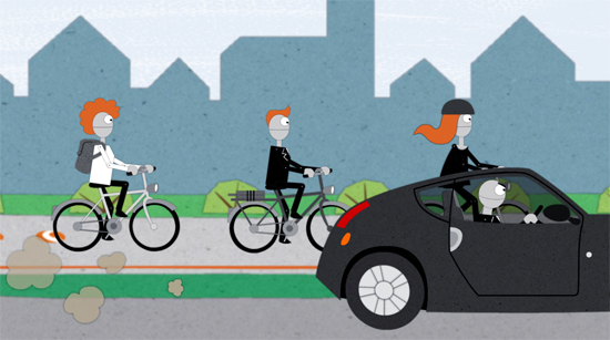
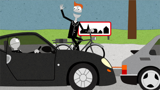
The customer thought it to be too kiddie style (again!), so I opted for a more “adult” or neutral look, and ended up with:
A couple of stills from the film:
The three of us working on these films – Alfred Gunnarsson, Niklas Ström and me – call ourselves Animationsbyrån. We’ll launch our new website shortly. We just completed the Cykelsuperstier infomercial. You can watch it here.

